Poster of a Girl - 1973 Edition: [1973 Week]
/It’s time for another poster post since looking at posters from 1973 is incredibly intriguing. And you’ll see some amazing posters here. Man, things were really different back then, sometimes for better, but mostly for worse. Keep in mind that many of the more outrageous posters are of movies that are obvious B-movie trash, but then again there are some posters that look silly and have some known names on them, on movies I have never heard of. As always, I scanned the IMP page for 1973 and picked a lot of posters to look at. I’ll put them in categories again, like in 1980, because I just couldn’t leave out so many of them and the themes are very recurring. There’ll be a gallery for categories with many posters so you can see for yourself, but I’ll highlight some favorites. This is not the week of short articles!
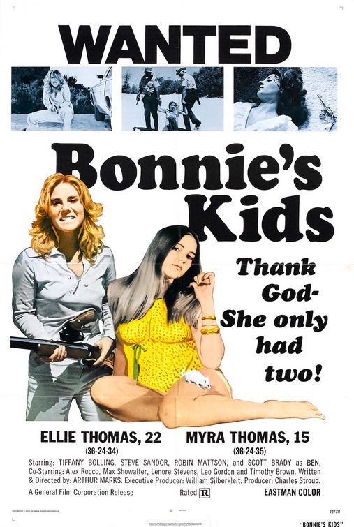
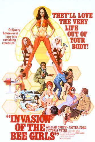
Add Women for Sex Please
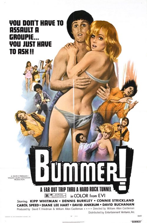
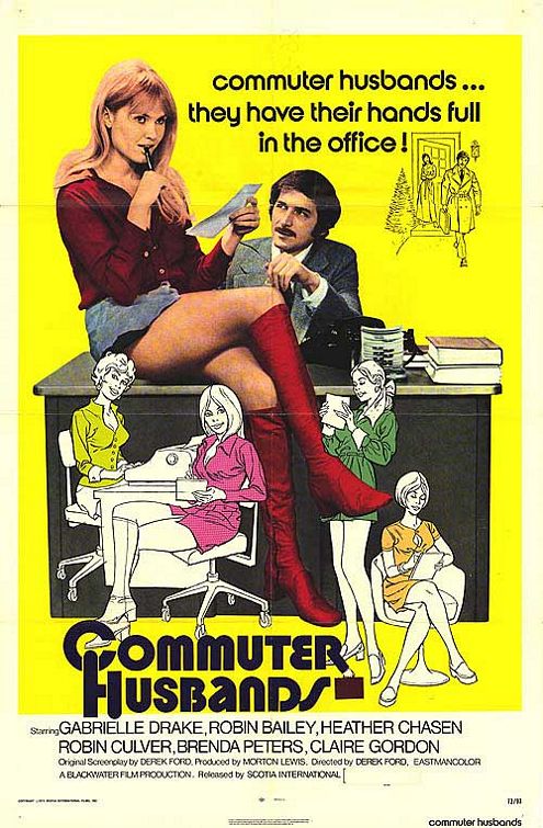
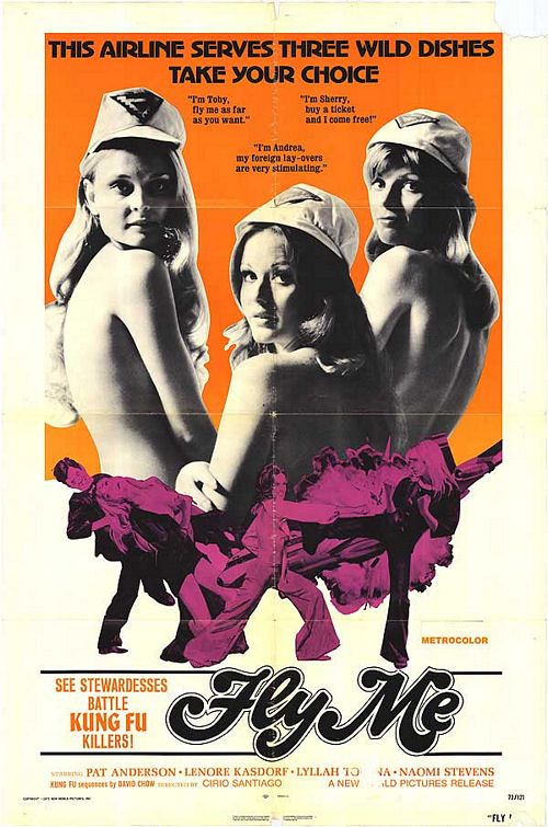
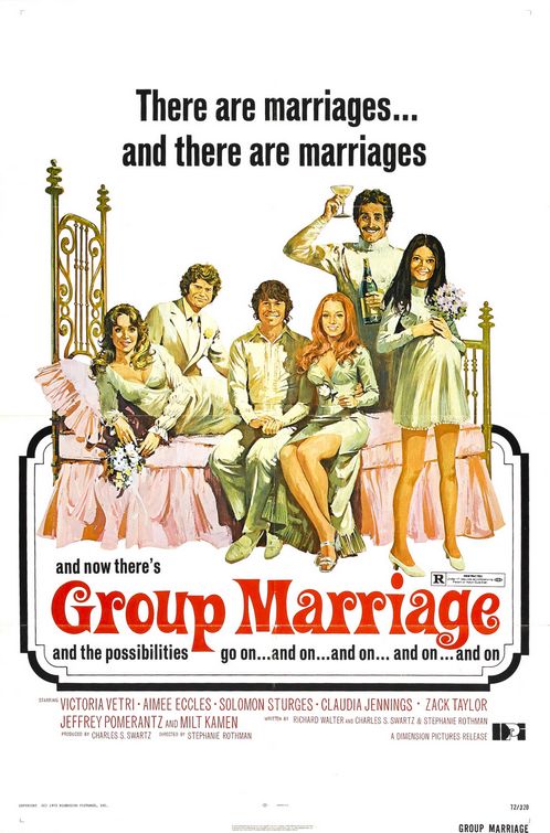
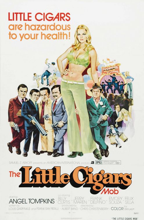
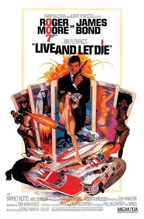
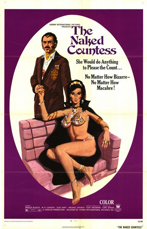
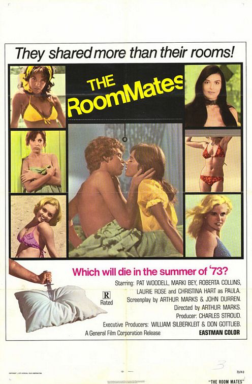
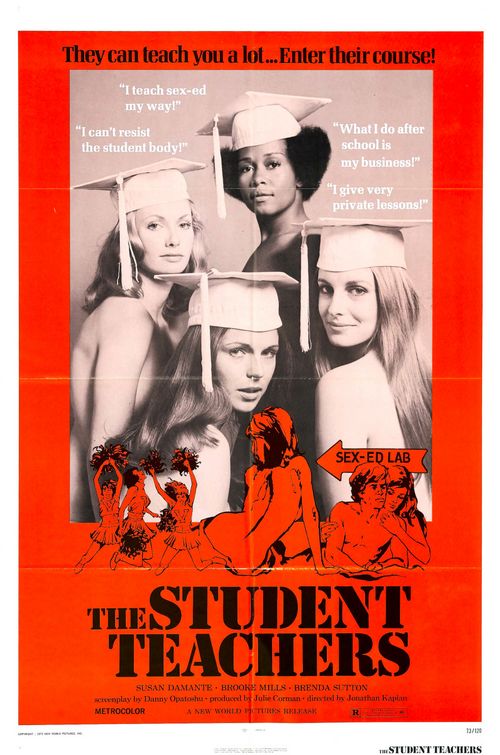
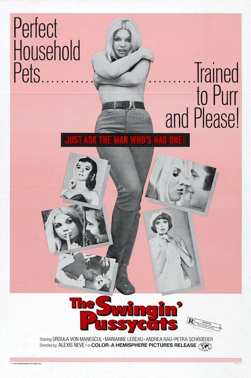
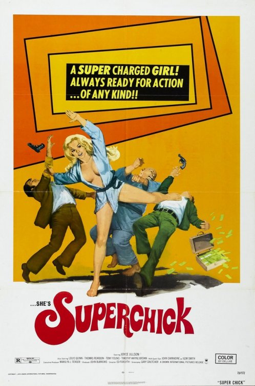
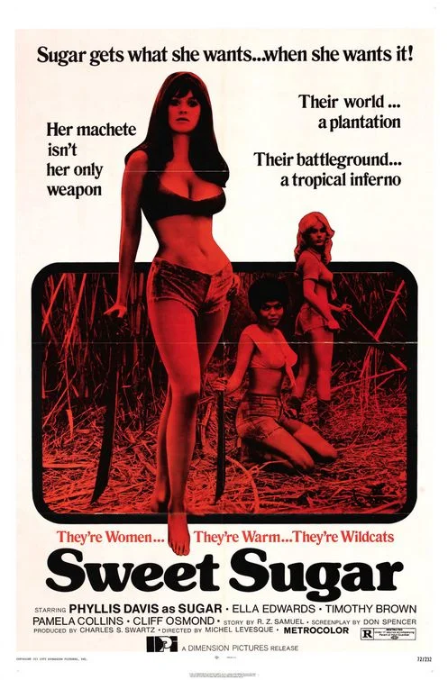
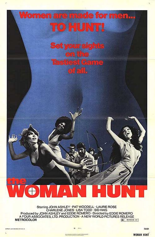
It seems to have been a very natural thing to use women’s sexuality for advertising reasons. This are some of the most exploitative images you can imagine and the intention couldn’t be clearer. Women are mostly in bikinis or underwear, their sexuality is clearly highlighted or it is made clear that they serve as sexual objects for men. Some of them look like porn movies. Remember, I’m just talking about the posters, if you read up on some of them, you’ll notice that they tried to portray women as strong and independent. But these posters don’t sell that but they only sell sex.
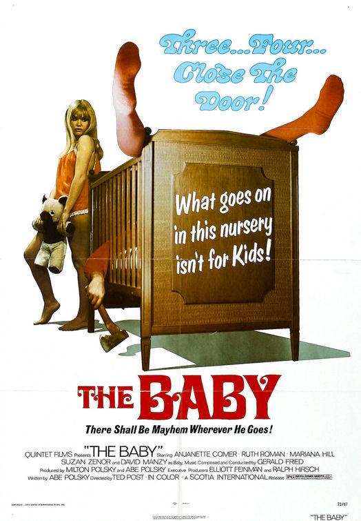
The Baby is a perfect example for what I was talking about. It’s a WTF poster if there ever was one. You have no idea what it is about or even what genre it is. A sexy woman with a teddy bear doesn’t help. So, I look at the credits and it is directed by Ted Post. Not a master director, but at least he is no unknown either, having worked with Clint Eastwood. And he made The Baby. It’s one poster where I didn’t look up anything to enjoy the mystery of this absurdity a bit longer.
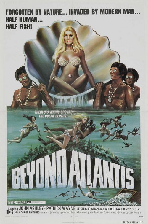
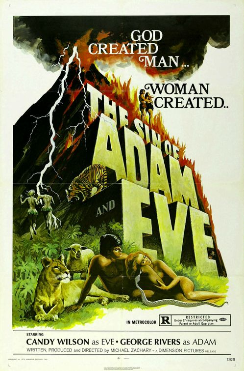
Beyond Atlantis must be one of the worst, not just for the sexual exploitation, but also because of the racism. And the eyes, man, the eyes. Also, the tagline talks about the invasion by modern man, but the image shows huge cities in the ocean. And The Sin of Adam and Eve claims women created sin. How about that for women’s lib?
Black People Are Tough
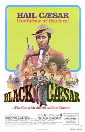
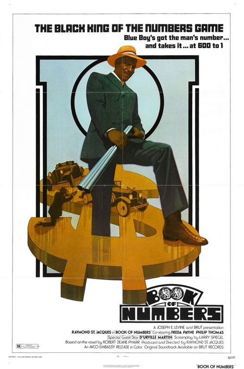
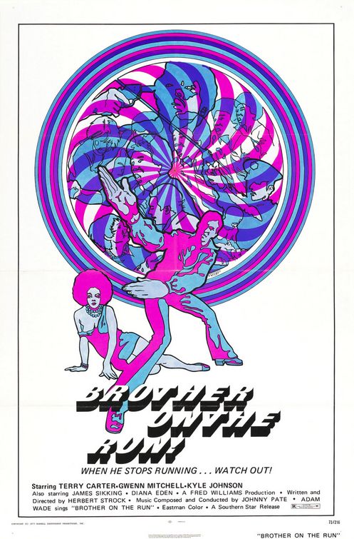
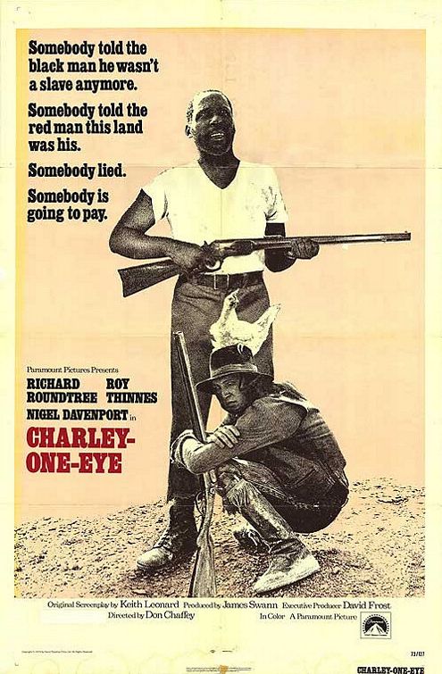
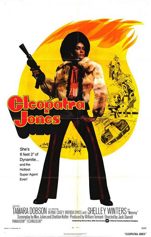
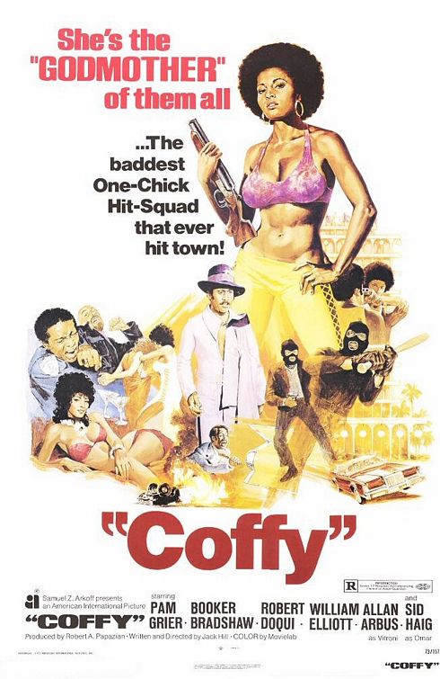
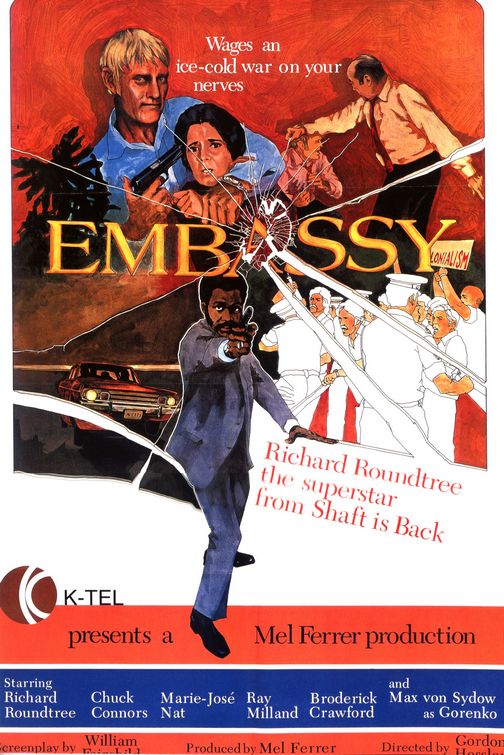
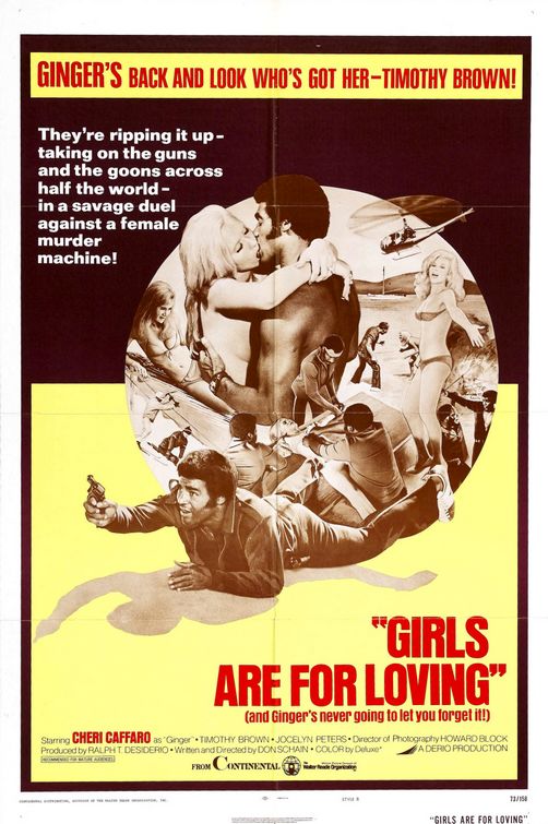
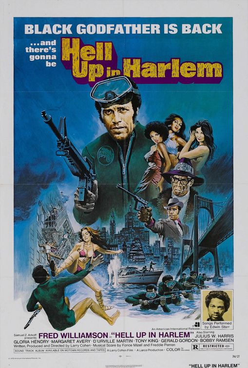
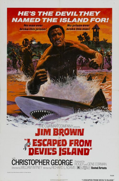
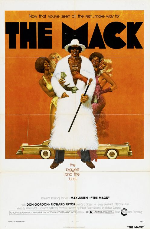
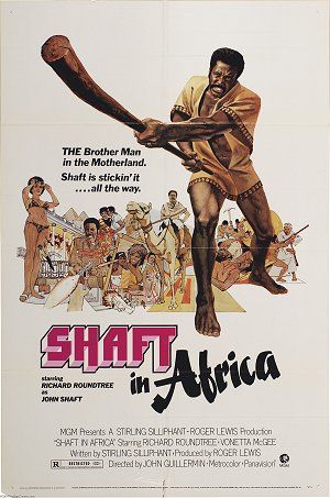
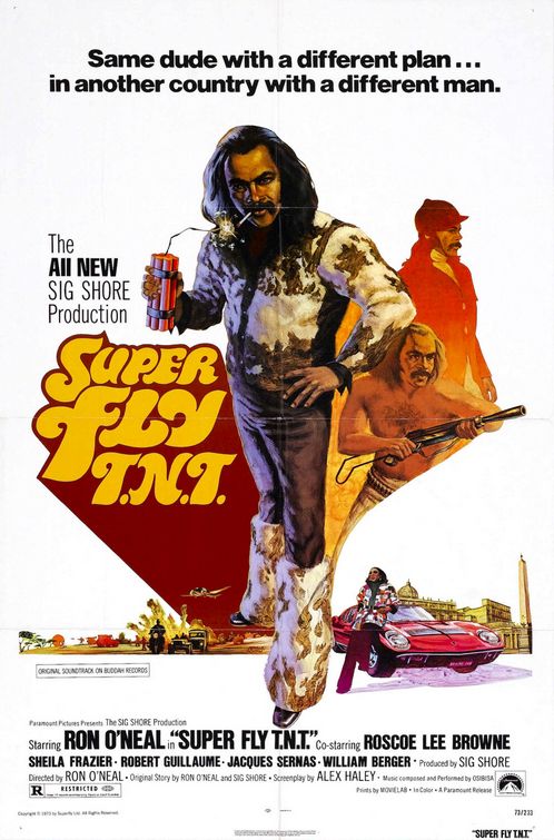
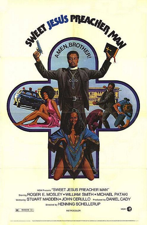
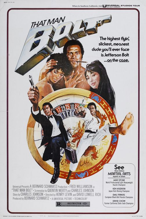
So, this is something very specific for its time, I guess, having many movies with African-Americans in lead roles, even women! BUT, if you look at the poster, you see a depressing trend. All of the 15 examples here show them with weapons in their hands. Many are gangsters or pimps. Don’t get me wrong, I know, these movie were important for African-Americans, despite all the stereotypes, but… they still are full of stereotypes. They are all empowered on these posters, but mainly by being armed. Another trend is the extreme sexism that’s prevalent here too. You have to give credit to Cleopatra Jones for not sexualizing her on the poster, that’s quite an exception. Just look at Pam Grier’s breasts being bigger than her shotgun in Coffy. So, it’s interesting to see this kind of black cinema alive in the blaxoitation era, but at least the posters are problematic too. Would be interesting to analyze some of these movies, though. Blaxploitation week, anyone?
Un-Blax Black Cinema
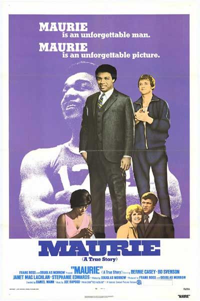
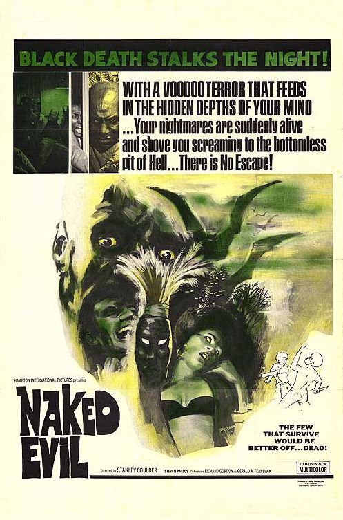
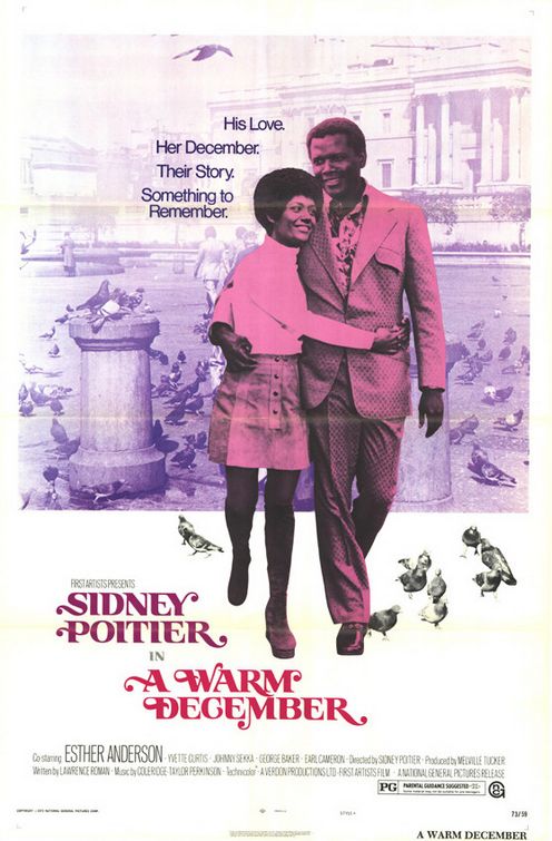
It’s fascinating to see three examples that don’t fit into the above category. Maurie and A Warm December seem really to focus on African-Americans without stereotypes, as normal people. I mean, seriously, a poster like A Warm December is extremely rare nowadays. The other end of the spectrum is Naked Evil, which cranks up the black stereotypes up to 11. “Black Death”? Oh man.
Crazy, Cruel World
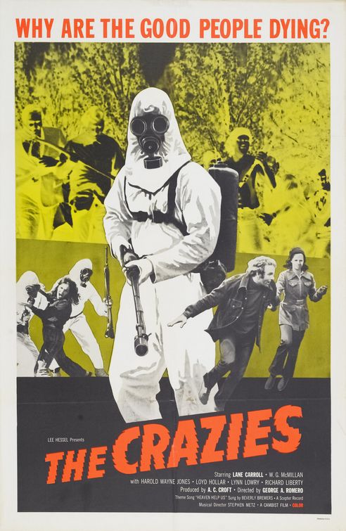
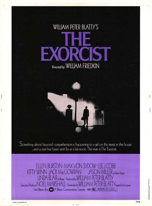
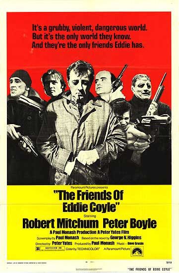
On these three posters you see some of what we saw in the movies and songs of that year, the idea of a world that is “cruel, violent and dangerous”, that shows things which are “beyond comprehension” and in which “the good people [are] dying.”
Support Your Men
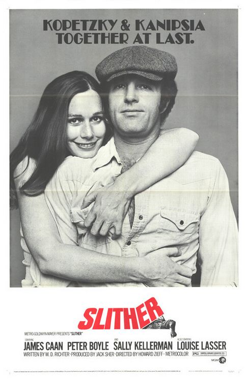
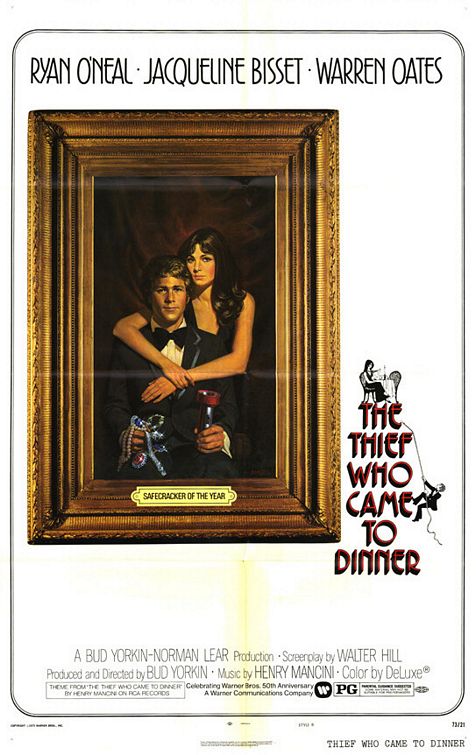
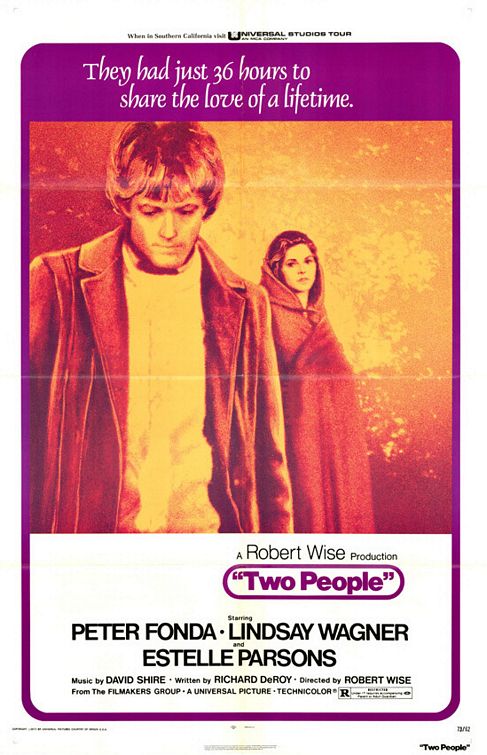
Only a few examples (there are more) of a movie about two people who have to follow the gender hierarchy of male foreground and female background. Especially Two People is so silly, having that title, making it clear it is about both of them, but then pushing her to the sidelines.
Cops Are No Good
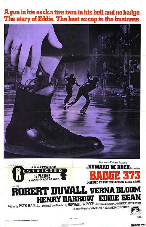
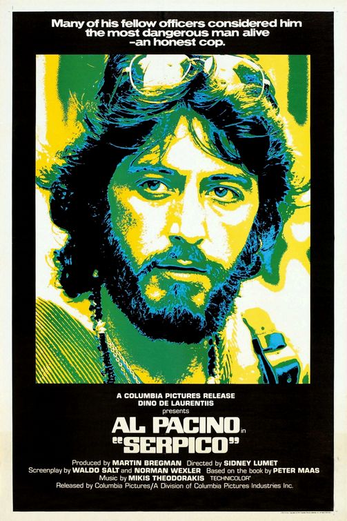
You’re either a vigilante or you get into trouble for being upright. I mean, the tagline of Serpico (a great movie that is all about that) says it all. “Honest cops? What’s that?” Fascinating to see that mistrust spelled out here so clearly.
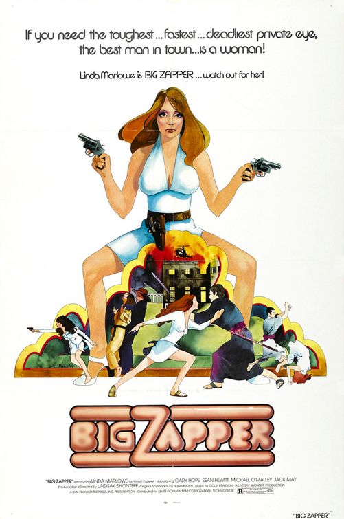
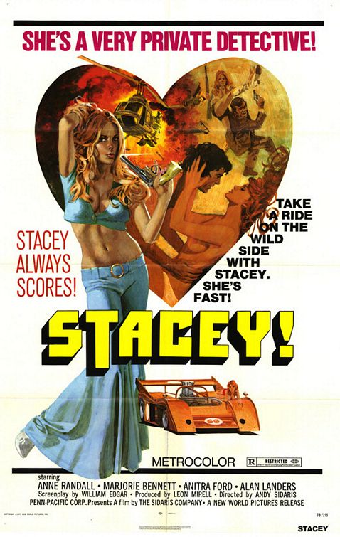
Women Are Angry (with cleavage)
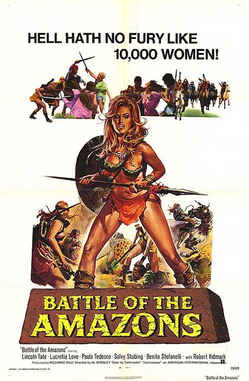
This is similar to the African-American movies. Here we have seven posters that position women in the centre as strong, active characters but they are so sexualized that it is completely misguided. In fact, some posters even go so far as showing that these strong women are dangerous, so that empowerment might not be a good thing. Bonus points for the bikini werewolf, though.
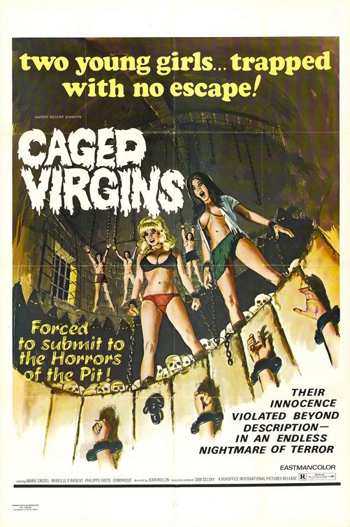
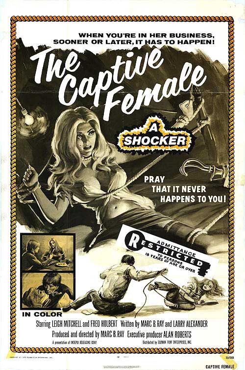
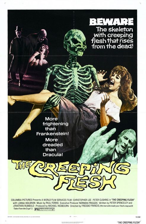
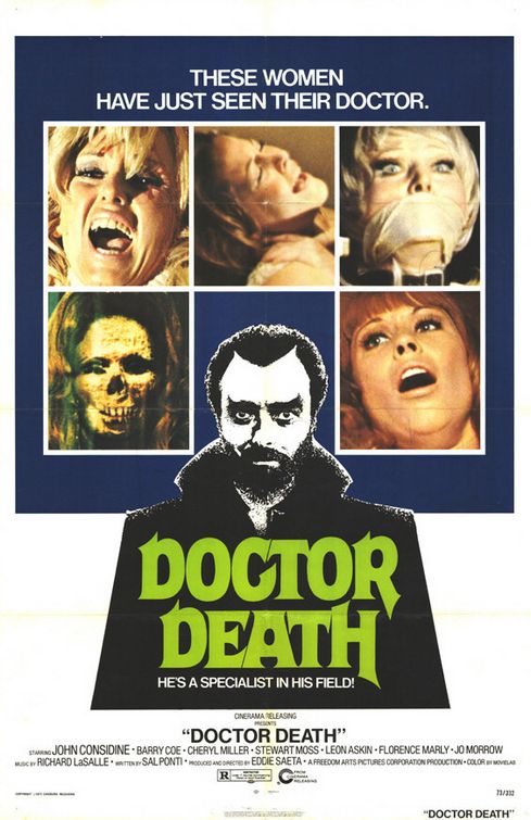
Women Are the Better Victims
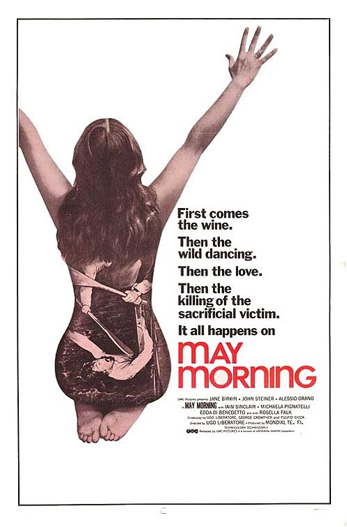
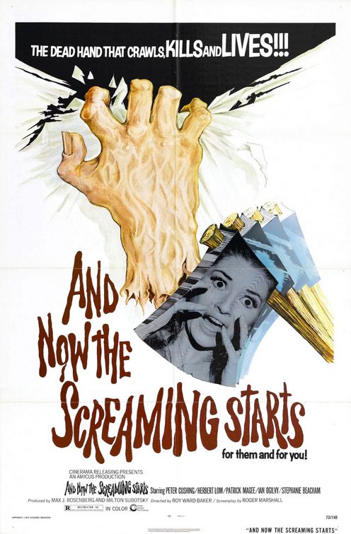
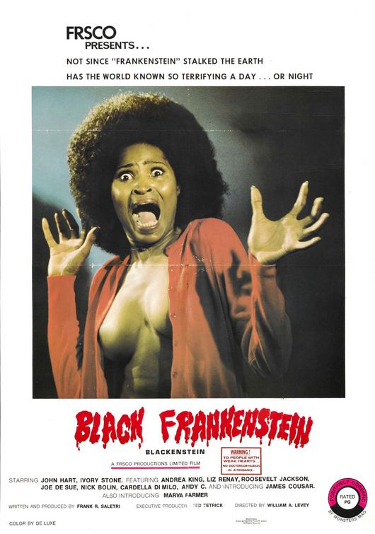
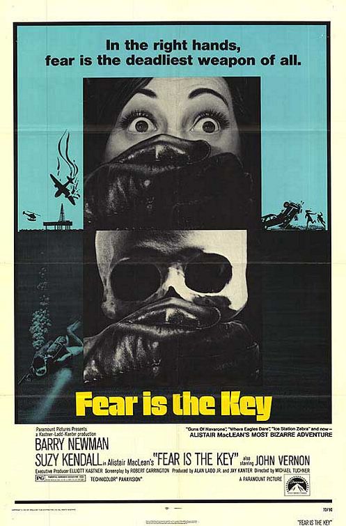
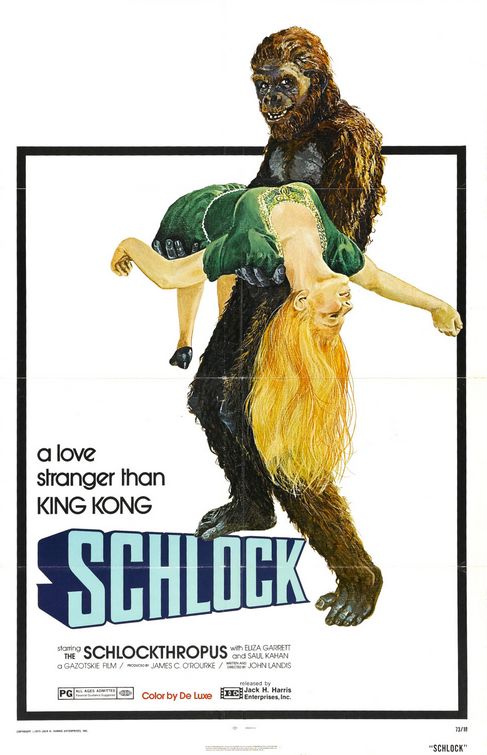
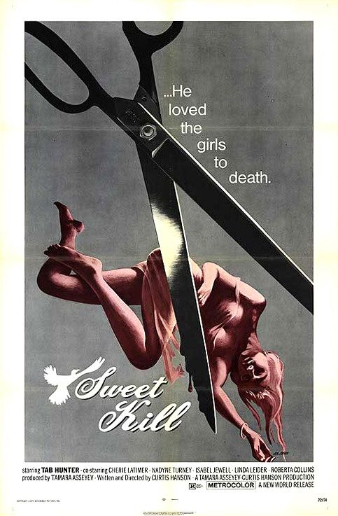
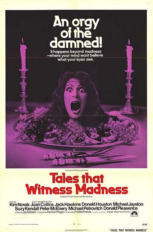
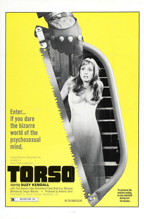
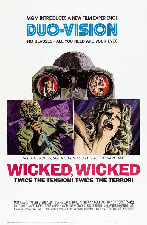
Again, the title says it all and these posters have wide range of displaying women in cruel, violent and demeaning situations. The worst part is probably that most of the time they are not only helpless victims, but also sexualized in that moment. Black Frankenstein leaves the victim nothing to hide. Often they are also forcibly muted, robbing them even of their voice, making them complete objects to mutilate or beheaded. The disturbing thing is that on basically all of them, there seems to be no redemption for these women, we are not even supposed to be really scared for them. There is an enjoyment in scaring and killing them that is hard to deny and really unsettling. Is that anger at the women’s liberation movement, men being furious that women attempt to challenge them? I wouldn’t rule it out.
Honorable Mentions
Finally, some posters that either didn’t fit into one of the categories or that deserve special mentions.
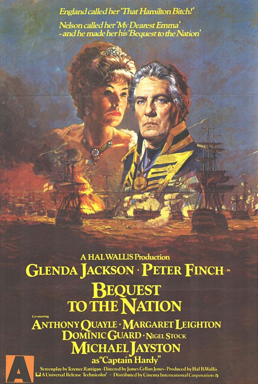
Calling a woman a “bitch” on a movie poster? Wow, hard to imagine today.
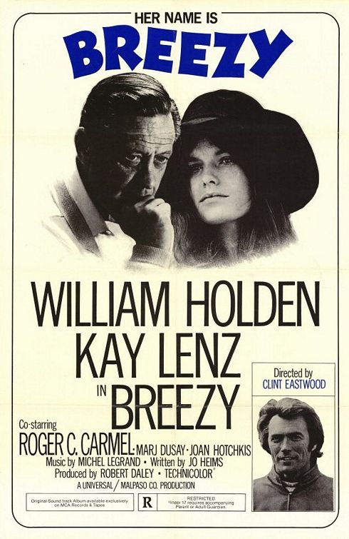
"I’ve heard that director’s name before, who was that again…? Oh, there’s a picture of him on the poster, how convenient."
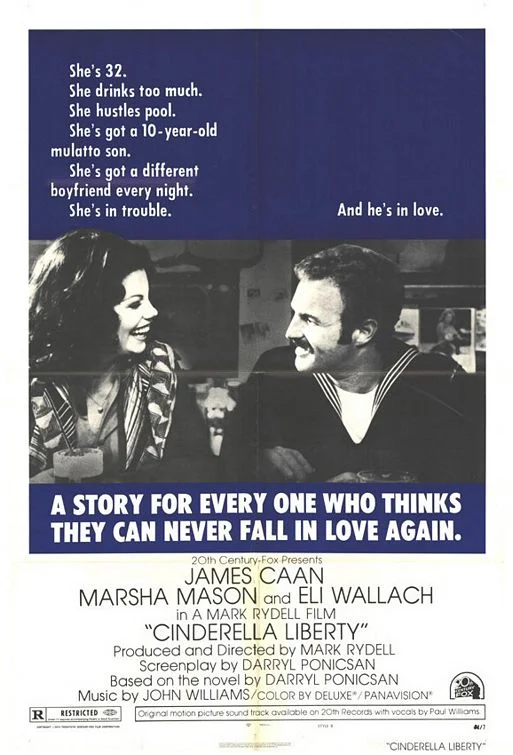
I’m not sure what to think about this one. Is it good, because it offers a versatile woman character or is there something wrong about that depiction? I can’t put my finger on it, but it fascinates me.
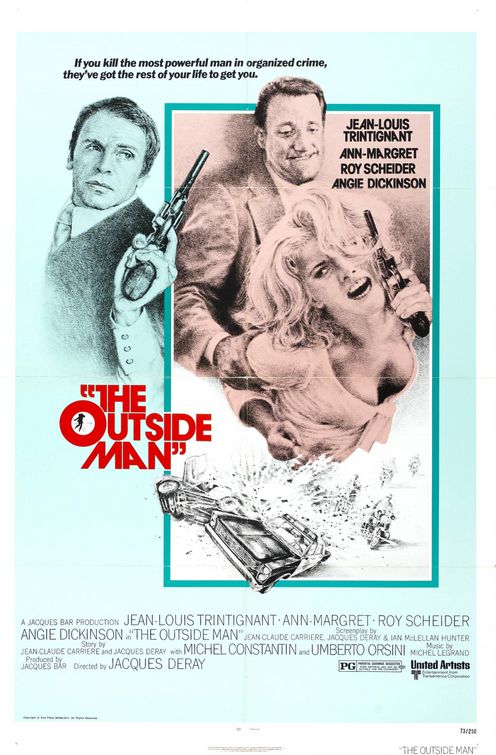
Fine, she wears pajamas, but this still shows a man and a woman side by side, both with equally sized guns in their hands. Even the tagline celebrates equal hardship for living in this world (=culture), so there you go.
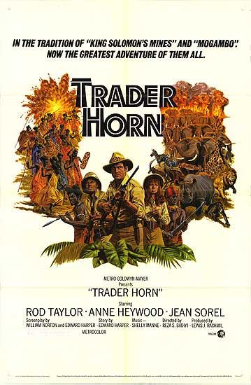
And finally, all the worst stereotypes of Africa combined in one horrible poster.

