Poster of a Girl - 2004 Edition: Hidden in Plain Sight
/You’re probably saying: “I know what’s coming now. Posters in 2004 were sexist, just like in 2012, 2015, 1988, 1980, 1973 and 1940, always the same.” Well, yes, that’s true but I wanted to try something slightly different this time. Slightly, because instead of focusing on sexism in general, I want to focus on one particular way of posters being sexist: by naming all of the actors on the posters except some female ones. Strangely, I found a lot of examples from 2004 posters for this, so here we go.
This is the poster that made me aware of the trope. Sure, there are many unnamed people on this poster, men and women, and Ice Cube is definitely the star but having Queen Latifah prominently on the poster and not naming her (but Cedric the Entertainer!) seems very weird and wrong. Even if Cedric became known because of Barbershop, Queen Latifah is the bigger star here or at least big enough to get equal billing.
This poster shows well why this trope is so troublesome because you have to wonder why the makers of this poster found it necessary to add another woman on the poster but not adding her name. Why? Because she is so important to the plot but not known enough to get poster billing? Or because she is sexy and two are better than one? I don’t know but I can’t say I like it. She is Naomie Harris, by the way.
Doesn’t it have to feel bad if your name is left out of the poster when you’re standing next to Frankie Muniz and Anthony Anderson? But maybe it doesn’t matter if the photographer gave the instruction to everyone to put their hands in their pockets. She is Hannah Spearritt, by the way.
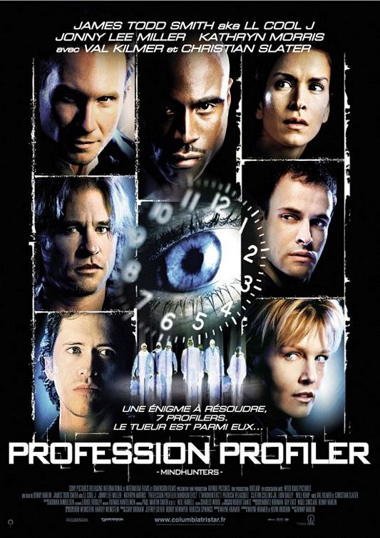
Fair enough, this is only the French version of the Mindhunters poster (a movie no one needs to remember), but, really, six names but seven pictures. It would neither be a problem to leave one picture out or to add one other name in this horrible font. She is Patricia Velazquez, by the way.
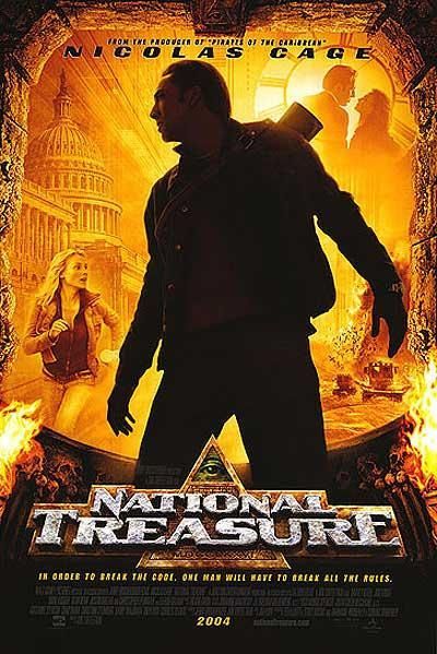
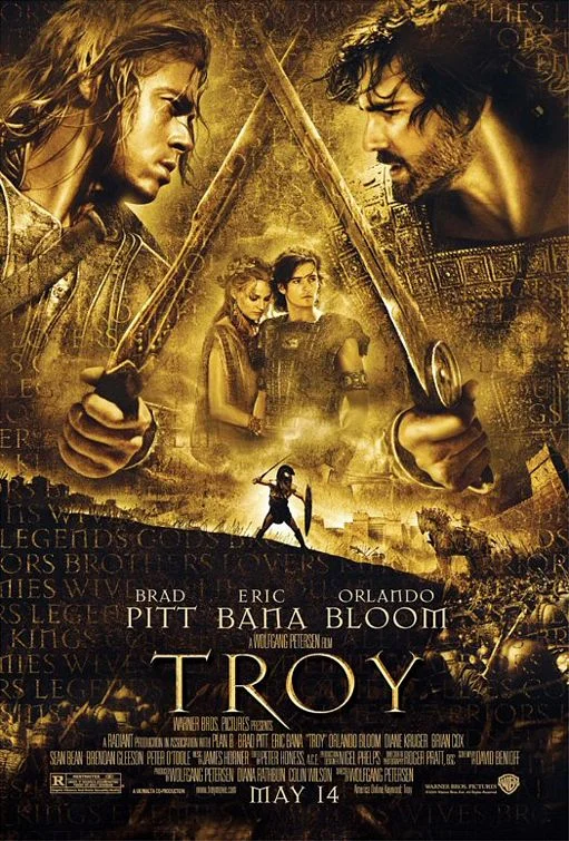
You could argue that this example is less clear, because National Treasure is clearly a Nicolas Cage vehicle. It’s less an example of “everyone is mentioned but her” because only Cage is mentioned, but still we get the impression that this woman seems somewhat important as she seems both in on the action and the love interest. She is Diane Kruger, by the way. Wouldn’t you think that in the year in which Kruger had her break-through with Troy she would get her name on the poster? Oh, that reminds me…
Well, she still is just that woman that the whole movie circles around and who is very centered on the poster. Really, seeing the symmetry of these four actors next to each other and then the three names underneath is somewhat unaesthetic.
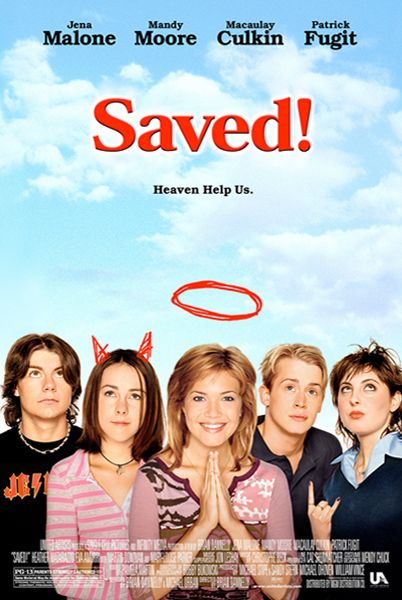
Talking about aesthetics. Why awkwardly cram five actors onto a poster that seems to have room for no more than three, but then only add four names? Consider something else, what if there are people who don’t know all of the actors’ faces? Do they just have to guess who is who? She is Eva Amurri, by the way.
There are many things wrong with this poster that photoshop obviously only made worse and, yes, Kevin Pollak is also left out of the billing. Although it would be helpful to have his name there and an arrow pointing at the weird figure underneath. But there are also two women prominently featured who are left out. And with all the weird shit going on here, they could put all the last names in without a problem. They are Amanda Peet (who even was in part 1) and Natasha Henstridge, by the way.
And finally, a different case because, surprisingly, her name is actually mentioned next to all the much more known actors, but she still gets a bad deal as the clothing and pose are just depressing. Who’s scamming who? Well, we are scammed into believing women are only there to pose sexy (and not to look dumb like everyone else).


