Poster of a Girl: Grey Exodists, the Hips and Nazi Shadows
/I’m a bit too relaxed during the holidays for great ideas, so I pick an easy topic today: more movie posters! As always, I checked the IMP homepage and took a look. Here’s what I found.
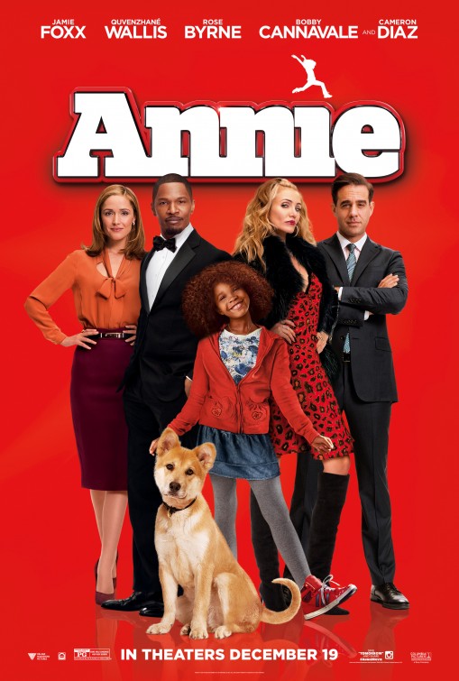
Sure, it’s a more ethnic (or black) update of the classic movie and though it’s not supposed to be very good (the poster certainly doesn’t make it look like a good movie), again, we have a women problem. Okay, the Annie girl is just a girl, so that’s that. Jamie Foxx and Bobby Cannavale stand there, cool, no big posing, just the men they are. Cameron Diaz has to go all the way to sexy and slutty, hands on her hips and Rose Byrne has to be extreme opposite, reserved, sober, hands on her hips. What’s with the stupid hands on their hips? Do woman have nothing else to do with their hands and hips?
Maybe you have heard about the controversy regarding Exodus and its casting (if you haven’t, read this great article). But looking at the poster, I don’t see the problem of using white actors for dark-skinned characters. If you make them all grey, it’s all equal again (yes, this looks very silly).
You know what I really have started to love? Women hiding behind strong men, holding on to them, looking for protection. We really need more of that because there just aren’t enough posters to show that.
I’m not a fan of this movie anyway, because it’s based on a Mark Millar comic and will be similar to his Kick-Ass, insofar that violence, torture and misogyny are celebrated (and, yes, Millar, has also written some good stuff, I know). The poster is all weapons and explosions and it’s all so goddamn cool. Does it help that there is only one woman and her thing is a prosthesis she uses to fight. Wow, so cool. Why three fine actors put up with this nonsense is beyond me but then again Millar’s stories are very popular, so it shouldn’t be a surprise.
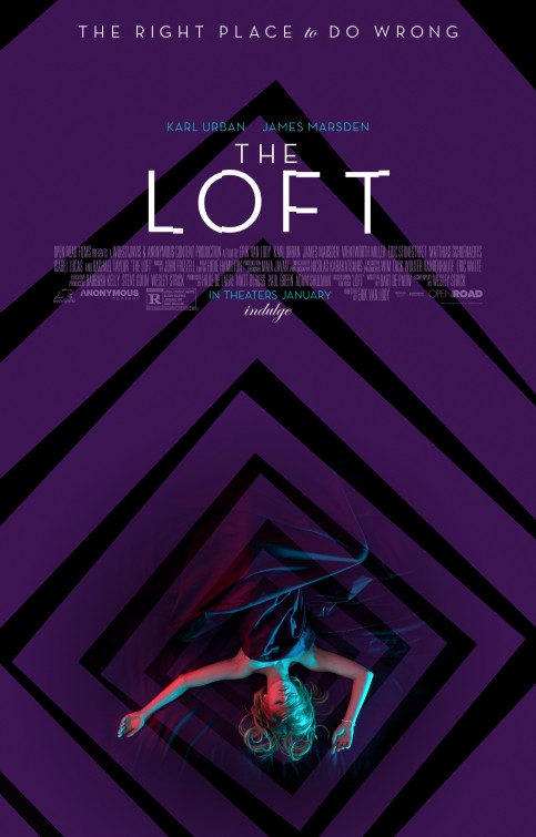
The tagline in combination with the image of the woman lying there, naked under the sheet, maybe dead, does not look appealing. I know the plot, but the poster alone sells the concept of “The place where men can do what they want.”
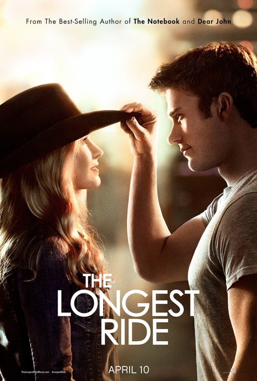
Is she, like, a statue? Or a mannequin? Because it looks like she just passively stands around while the man is the active one, putting a hat on her head, which she submissively accepts. I know, it’s just a moment, but they picked this moment, showing these aspects, passing on those memes, as it was done before and before and before.
Why not include something from the fringes of movie posters? This one is especially peculiar as the man looks very freaky and woman looks rather strong and though. Still, he is the bigger one, having her in his arm. Even if everything else doesn’t fit the terminology of “woman needs man”, a poster has no problem shoving it in this direction anyway.
Now, here is this episode’s exception. Men and women are all together, it’s hard to see anyone more in the spotlight (except Chris Rock, the movie’s star). This one woman holds on to his shoulder, but apart from that this is the most even poster we get in this line. There are more men than women, but they don’t really get any special treatment and the women don’t have to pose in any particular way. Is that so hard? That this poster is an exception tells us a lot.
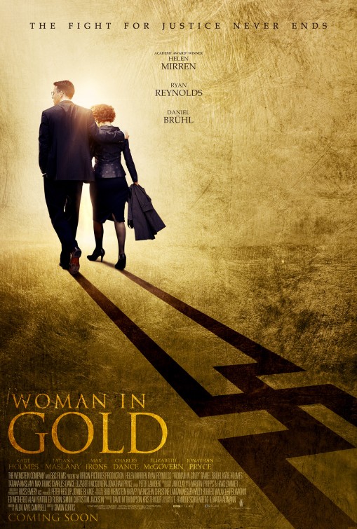
Once you have “woman” in the title, you have my attention. How does a movie like Woman in Gold treats its titular woman? Well, she is in the arm of a big, strong man of course, where else would she be? Does a Holocaust survivor really need the support of a young man? She obviously was strong enough to survive, why doesn’t the poster reflect that? Oh, and by the way, while the idea of the swastika shadow is interesting, it makes both of them look like Nazis, not the ones fighting Nazis. Nice try, though.
As always, the result are the same. Equal treatment of women is hard to get by on movie posters. The same tropes can be found all over again and it doesn’t look like anything’s about to change here.
Similar Posts

