Poster of a Girl - 1988 Edition: Yes, It's Her [1988 Week]
/Okay, for the grand finale I have to rush an article because time is running out. I’m always trying to do seven articles for theme weeks, which just shows how much the breaks between posts are necessary. But I did it again and am proud, so there you go. Anyway, here is a quick rundown of some posters from 1988, but it’s not a complete analysis like in the last theme weeks, but more a snapshot of mostly bad examples. So, this is not representative but exemplary.
Well, at least she is still wearing something, right? And it probably is hot at the center of the earth, so this probably makes total sense.
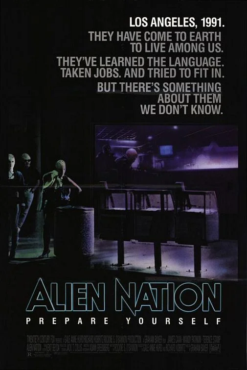
I don’t remember the movie so well, but the poster seems to suggest some immigration parable in which the immigrants are not to be trusted. But I seem to remember that the movie was somewhat intelligent and not conservative (and wasn’t it even followed by a TV series?), so the poster puzzles me a little. But it’s fascinating how the poster is very explicit about that parable. Could anyone think this is meant to be something else?
I’m not sure I can add anything to this poster. The combination of the title and tagline alone is confounding, the hairdryer and the purse and… well, the flying “bimbos”. Wow. Female empowerment, anyone?
I liked this movie a lot when I saw it as a kid, but I’m pretty sure it’s not great. Anyway, the poster is fascinating because it really is nothing but Blob, but of course we need a helpless woman inside it to be the victim.
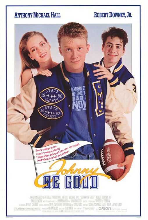
Yes, I know, it takes a while to take that cover in. Though I do love that there are two shrunken heads on Anthony Michael Hall’s shoulder, you have to wonder how three heads get on the poster but only two names. And how unsurprising it is that the woman is left out. (And yes, this is Uma Thurman, who seems to pop up in those poster posts very much).
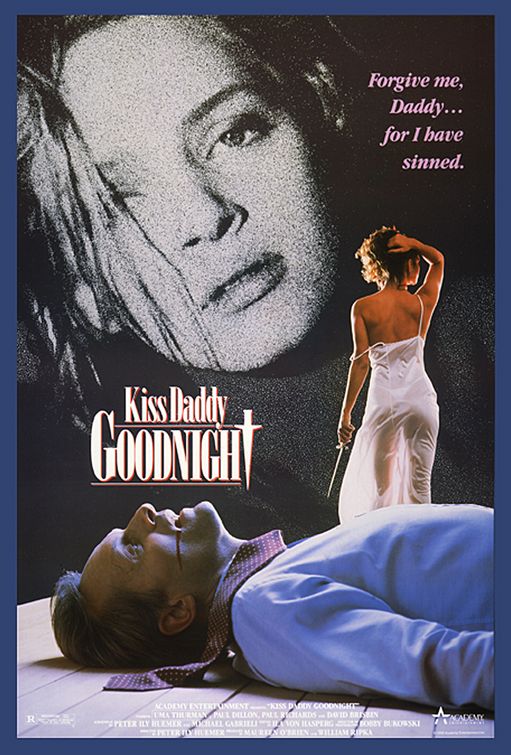
Wow, so much done for women here. They are shown as killers and victims, so there’s diversity, and it’s also made clear that their only asset is their sexuality, as shown by the subtle shoulder reveal and the well-lit crotch shot. Add some incestuous fantasy with the tagline and you have a great poster. (And yes, this is Uma Thurman. I know, it was not intentional).
Yeah, guys, you really have all you need, a cool car and a hot chick (which is not Uma Thurman, but Heather Graham, I think). They really do have all the brakes.
What do you call a photoshop disaster before there was photoshop? A scissor disaster? Fair enough, a movie with that title shouldn’t surprise anyone, but this cost $26 million dollars (and only made half of it), with two big stars in it. Okay, it is an incredible stupid movie which features Kim Basinger as the stereotypical sex bomb (which is exploited in the movie to the fullest, that would have been another good one to analyze). The poster does a good job of that too, though, so there you go. (And yes, that is Alyson Hannigan to the left… that is a nice pleasure when looking at the 80s).
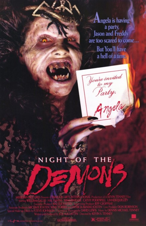
I really love the metaness of this poster, name-checking Jason and Freddy to show just how scary that movie is (which I had never heard of before). It’s not really working, but I love the attempt of meta-advertising.
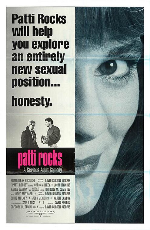
What a great tagline. Seriously. It’s provocative but clever. It makes you think and features a woman in a central way. It even only looks slightly dated.
Does it only seem to me like this poster suggests that the hero can pick between three women? Well, at least the tagline mentions they are intelligent. (Yes, Patrick Dempsey and Jennifer Connelly).
This looks like the trashiest movie ever and I’d laugh about it, if I didn’t know the movie. Anyway, I like that the tagline includes “You might even vote for one this fall.” because it makes clear that this is a bit more than it seems.
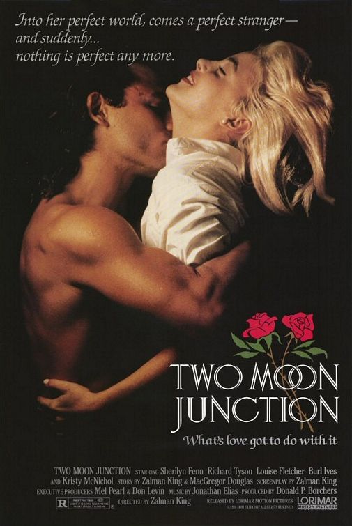
There is “perfect” twice, which is very weird because it is unclear what it is supposed to mean. Especially the tagline in connection with the picture which suggests that it is still perfect. It’s a movie by Zalman King, so you can’t expect much but at least this is the rare occasion where the poster sexualizes the man and not the woman, though she seems awfully passive here.
And then, there is this. Aside from the overall weirdness, the woman is used so awfully for her sexuality that it beats almost anything else. Not the poster you’d expect for Caine and Kingsley.
That was fun! And not so short. But the week is over. If I had feedback, I’d like to hear if anyone wants more, but I’ll do it again anyway, I just enjoy it too damn much.


