
Poster of a Girl - Posters Can Be Champions Too
/Time for posters again! I have an overload of movies to write about right now and an empty head when it comes to non-movie topics, so I’ll take the easy road again. I’m still always thankful for suggestions for topics, be it here in the comments or on Twitter or even Facebook. Anyway, let’s take a look at a selection of current posters taken from the IMP homepage.
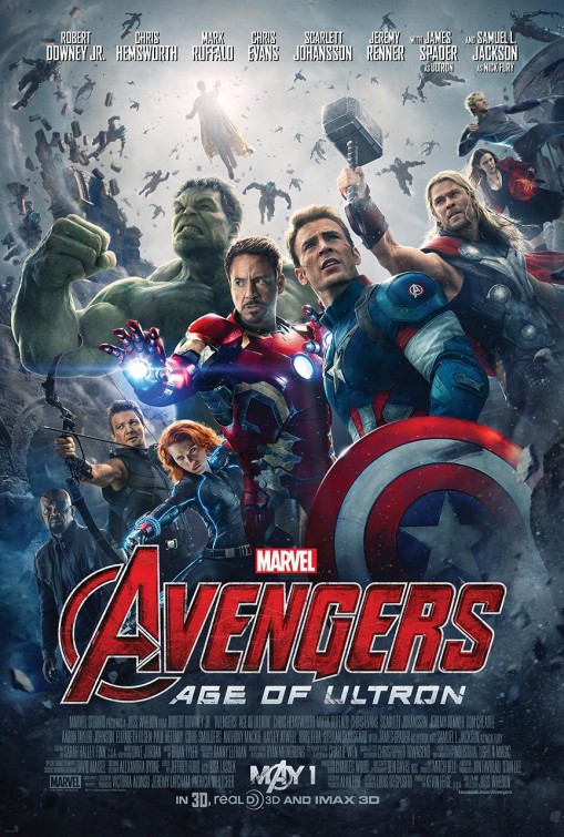
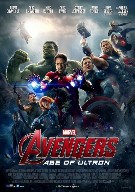
I decided to put the latest two versions of this poster side to side, so you can see how odd the process is here. Considering this will be one of the biggest movies of the year and you might even assume that it will be relatively good for this kind of movie, it’s disheartening to see such a lazy poster job. Let’s not talk about the woman-man-ratio here, as we still have to wait for a long time till that changes in comic book movies (even the change in comic books is slow), but this kind of photoshopped collection of characters, moved around back and forth at will is so frustrating. Do they really all have to be on the poster in the first place? I know this is not related to anything culturally, really, but still. It’s the choice for superficial instead of substantial that seems symptomatic to me.

There are more posters for this movie and as much as we need another Cinderella based on horrible source material (there is no argument for me to pass on these old fairy tales, they are really horrible in the messages they are conveying), we also need more posters of young girls in fancy fairytale dresses that makes them look very innocent but still has room for a little cleavage. Look, I have nothing against dresses per se but I don’t see the need for fostering the image of women as beautiful little creatures that only care about dresses and princes. (And I’m noticing this trend more and more as I see many students reading those Selection novels… man, that would be an article all by itself).

I really don’t know what to think of this. It falls into the Women Are Cool When They Act Like Men-category combined with the idea that women can go nude to look more interesting. Again, the same thought exercise shows its problems: Can you imagine a similar poster with a male star? Can you think of posters that are very similar? I can assume the answers are No and Yes. And I know, “Hey, it’s a strong female character! In the lead!” and it is, but I still find the poster problematic.
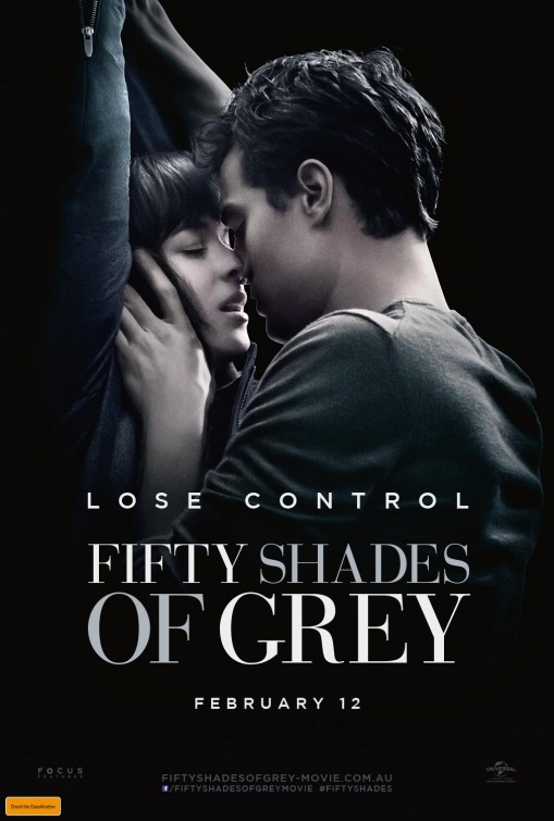
Yes, 50 Shades again and everyone has seen that poster already everywhere, all the time. I just want to point out again, no matter what actually happens in the movie, it shows a woman bound and with the man’s hand around her neck AND the tagline Lose Control. The implication of course is “Woman loses control, man gains it.” And I haven’t bought into the argument yet that she is in control by allowing him to have control over her.

It’s one of the posters I wish I hadn’t read anything about the movie because the poster gives the cliché an interesting spin as the woman is in the forefront and the man behind her. It’s the same thing we have seen on dozens of posters already the other way around. I like the idea, but the poster still looks too artificial and if the reviews are right, then the movie does not do the poster justice at all, making our heroine a classic damsel in distress.

Besides being a really well designed poster, there is a nice equality here between women and men, putting the women on top. And I am always happy to see Mia Wasikowska on a poster (if it’s not Alice-related, that is).
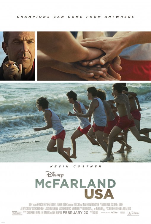
That poster is fine design-wise, boring, sure, but that tagline drives me crazy. Champions Can Come From Anywhere? Is it just me or is there so implicit racism in that tagline? It raises ideas you wouldn’t have thought of without it, like Champions can only come from the U.S. Of course champions can come from anywhere, why is that even spelled out? Let's not even talk about the "White Savior"-trope.

Again, there is nothing inherently wrong here, it has a woman in the leading role and she is the centre of the poster. It’s not her fault that the design is bad and overly sci-fiy and gritty and neony.

Finally, a terrible entry. Apart from the “comedy” aspects that definitely not make me want to see this movie and the fact that Tom Wilkinson doesn’t look like Tom Wilkinson, but like Jeff Bridges, there is something else that really bothers me. The men are having fun, best business trip ever and all that, the woman is serious, well-dressed and (implicitly) boring. The man who doesn’t seem to have fun at least seems crazy but at least not dull. Again, can you imagine a woman instead of one of the three men up there doing crazy shit? That of course only works if it’s all women. Well, those rules are hard to bend.
See you next time!